Podcasting for business is a lead generation goldmine! But don’t treat it as just another content channel to add to your social presence. Think about how you can make your B2B podcast stand out from the increasingly crowded industry.
According to industry statistics, there are 2 million active podcast shows (over 500,000 on Apple podcasts) and more than 48 million episodes. While these numbers are dwarfed by alternative content formats like blogging—with more than 600 million blogs floating around on the internet—there’s still a level of competition in the B2B podcasting space.
But in the midst of competition lies opportunity. Companies are scurrying to create business podcasts for a reason. The field is lucrative and on an upward trajectory. The Infinite Dial 2022 by Edison Research estimates that 62% of Americans have listened to a podcast as of 2022—from a modest 11% back in 2006.

The aim of highlighting the podcasting statistics was to stress the importance of setting yourself apart from the crowd. The opportunity is there, but you must position your business podcast favorably to claim a hearty share of the pie. And creating a compelling podcast brand is one way to define your identity in a competitive industry.
When done right, branded podcasts can be an immensely powerful marketing and content strategy for your business.
This lesson of the “Podcasting Mastered” course covers the best practices in podcast branding to grab the attention of listeners and keep them coming back. You should be equipped with practical knowledge to influence how people perceive your brand for sustainable podcasting success by the end of the lesson.
This post is the 6th in a series of “Podcasting Mastered” chapters designed to help you launch and grow an enterprise lead-generating podcast.
There has never been a better time to make your voice heard – and we’re here to help master the art of podcasting with step-by-step guides.
Get the new chapters sent directly to your inbox, as soon as they release.
We follow strict no-spam policy. Your information will not be sold.
Podcast Branding 101.
First things first, what is a brand?
According to Investopedia,
“The term brand refers to a business and marketing concept that helps people identify a particular company, product, or individual.”
Effective branding is about cementing memories, building relationships, and evoking emotions around your brand. It’s about creating deep connections with the listeners and making them feel part of a community.
But contrary to common misconceptions, your brand is not the logo or other visual elements. Your visuals are merely brand assets. They are a small but crucial facet of your overall brand.
Creating a successful branded podcast is about creating eye-catching visuals to hook listeners (grab their attention) and quality, compelling content to reel ‘em in (convert them into loyal listeners/clients).
To master branding, you must master your visual identity, brand voice, listener experience, messaging, promise, values, and market position. Still, it’s the visuals that generate leads.
For now, we’ll focus on refining the visual side of creating a successful podcast brand.
How to Make Your Podcast Brandable – With Attention Grabbing Visuals.
Stunning and professional graphics speak to the quality of the show itself. Your brand voice, listener experience, and gripping content keep listeners coming back. But it’s your business podcast’s visual identity that lures new listeners/prospective clients to give you a try and hooks them.
And as much as we’re often told not to judge a book by its cover—sometimes it’s just human nature to do exactly that. In B2B podcasting, listeners scrolling through a directory are typically bombarded by an overwhelming number of podcasts.

The difference between a potential client glancing nonchalantly and stopping to click on your show can be as simple as the ‘feel’ and appeal of your podcast cover designs or podcast logo designs.
In fact, the Discovery Stats Survey by The Podcast Host reports that podcast listeners rate a show’s artwork as a more important determinant of their ‘click decision’ than a podcast name or even a familiarity with the interview guest/presenter.
You have to pique your listener’s interest, evoke their emotions, and imprint your brand in their memories from the get-go. It’s about leveraging the power of first impressions.
So strap in as we walk you through tips, tricks, and examples to create podcast logo designs, podcast cover art designs, and podcast imagery that influence people to make that next click.
A. Podcast Cover Art Designs
Let’s say you’re looking for a good read—whether in a library or an online book directory. What is the first thing that draws you to take a closer look at a specific book? For most people, that’ll be the book cover. The same goes for a podcast. Like the book cover, your podcast cover art design is a salesperson to its audience.
Podcast Discovery Stats by The Podcast Host suggests that 40% of people discover new podcasts by searching on a podcast listening app’s directory. Another 13% browse through a podcast chart or the “featured” section. This could mean that your podcast cover art design is the first point of contact for more than half (53%) of podcast listeners and a potent ingredient in creating a memorable podcast brand.

An iconic design makes a strong impression and fosters a connection with the audience. It gives a face to the podcast’s personality.
Here are some best practices to create podcast cover art designs that click with listeners:
1. Meet Podcast Directories’ Requirements
The parameters set by a podcast directory are a good place to start when creating podcast cover art designs. For example, Apple Podcasts requires podcasters to adhere to the following cover art guidelines:
Size ranging from 1400 x 1400 to 3000 x 3000 pixels.
- 1:1 (square)
- PNG or JPEG formats with appropriate file extensions
- 72 dpi resolution
- RGB colorspace (not CMYK)
You should also look at some of the dos and don’ts specific to the podcast directory–whether that’s Apple Podcasts, Spotify, or Google Podcasts. This may include where to place your artwork element and the type of information not allowed on the design.
2. Content Leads the Way
What is your business podcast’s main topic, tone, personality, and type of podcast format? Ensure you have a clear understanding of your podcasting goals and plan.
Your podcast cover art designs should ideally encapsulate the ‘spirit’ of your show. Someone should be able to look at your artwork and instantly get an idea of what to expect. Everything from the typography, podcast imagery, color schemes, and podcast logo designs should support your core message.

Take the example of “Wicked or Wise, Women of the World.” The podcast logo design exudes a sense of femininity and power in line with the show’s subject of discussing women in the Bible.
 And if your branded podcast is created to specifically promote your existing business, you can incorporate recognizable brand elements into your design. Motley Fool Money is a good example that implements this idea with finesse.
And please don’t try to mislead your audience. Respect their time and ensure your cover art is a true representation of your content.
3. Design for Your Listener Persona
Your tastes and preferences are great—and it’s important to add your unique personality to your podcast artwork. But always keep in mind that it’s all about your target audience. Your listener persona should take center stage in all your B2B podcasting efforts.
Don’t attempt to appeal to everyone. As covered in Lesson #4 of our “Podcasting Mastered” course, niche down and identify your ideal listener. Focus on grabbing and maintaining their attention. What are your target audience’s interests? What are their pain points? And how does your podcast meet their needs and wants?
 A great example of a podcast that is designed for its listener is “Masters of Scale” with Reid Hoffman. A keen look at the visual design elements reveals how everything from the color scheme to the typography is geared towards fostering a connection with the audience.
See how the green is dominant; the color is associated with renewal, vitality, and nurturing. Doesn’t this tie with the subject matter of helping startups grow into global brands? Same thing with how the word “Scale” is depicted or how Hoffman pops up playfully, which is part of his overall demeanor in the show.
 Another example is the “Untapped” podcast, which targets an audience that yearns to live the lifestyle of their dreams by achieving financial freedom. To this end, Natalie Sisson hosts expert interviews, real-time coaching, and case studies to help her listeners effectively build multiple streams of income to “live life on their own terms.”
The artwork employs a dark shade of blue, which represents reliability and stability (perhaps financial freedom?). The yellow typography may be seen as a way to add some bubbly fun (i.e., live on your own terms?”. This same theme is seen in Natalie’s photo – appears professional, but with a friendly smile.
4. Less is More
Stay away from busy or crowded designs (unless in special circumstances). You likely have a lot to say, and it’s easy to be drawn into stuffing as much information as possible in your podcast cover art designs. But resist that temptation!
“The ability to simplify means to eliminate the unnecessary so that the necessary may speak.”
The brain has an affinity to pick up, process, and remember minimalistic designs. This concept of memorability is seen in traffic signs or some of the most iconic marketing logos (Nike, Apple, McDonald’s, etc.).
 In podcasting, take the example of the Pulitzer Award-winning storytelling podcast, This American Life. Simple and clear goes a long way.
5. Fonts
Typography is an incredibly important brand asset that sometimes slips under the radar. Your font choice says a lot about your podcast and may play an essential role in grabbing the right listener’s eye.
While the choice of fonts is relative to the podcaster and the sentiments of the branded podcast, there are a few rules that apply across the board.
Fonts in your podcast cover art designs and podcast imagery should:
- Match your website’s design.
- Match the message and feel of your podcast brand.
- Be easy to read
 Here’s an example: “The Daily” by Michael Barbaro uses a serif font, which has authoritative and old-fashioned (for print) connotations. This typeface is perfect for a news podcast that covers interesting everyday news.
If you don’t want your branded podcast to come across as cliché by using a font that’s in everyone’s word procession software, you can scour libraries like DaFont.com for some decent and free fonts.
6. Color Schemes – Leverage the Power of Color
Color can make all the difference in podcast cover art designs. According to research findings highlighted in Psychology Today,
“there is a real connection between the use of colors and customers’ perceptions of a brand’s personality”—and “the relationship between brands and color hinges on the perceived appropriateness of the color being used for the particular brand (in other words, does the color “fit” what is being sold).”
Another study mentioned in the same article claims that “up to 90% of snap judgments made about products can be based on color alone.” This scientific data only proves what we already know. That color is an immensely powerful tool when wielded appropriately.
“Color is a power which directly influences the soul.”
Finding the best color scheme for your business podcast is not about splashing your favorite colors around. There’s a science and art to the process. Take time to understand color theory and psychology. This is a whole lesson in itself, but this article by Adobe covers the essentials.
An easy way to start creating excellent podcast brand colors is by using the color wheel. You can use Canva’s Color Wheel to test out color combinations and find a blend that works for your branded podcast.

There are different ways to combine colors using the color wheel, including:
- Complementary:
 Complementary color combinations are typically on the opposite side of the color wheel. They pop in a visually-appealing way to radiate a vibrant personality. The motivational podcast “The Lazy Genius” balances blue and yellow hues for an eye-catching and fun effect.
- Analogous:
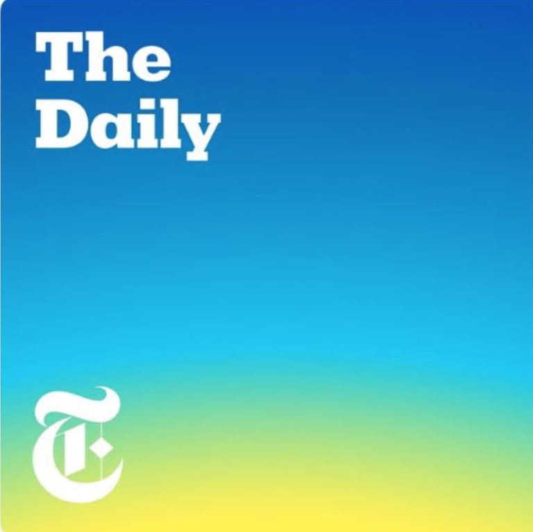 A combination where colors are next to each other on the color wheel. Take the example of “The Daily”, which uses an analogous combination of blue, green, and yellow. Blue is used dominantly with green and yellow as accents to avoid overwhelming the viewer.
- Monochromatic:
 This is basically one base color but in different tones or shades. The combination is easy to implement and versatile. It creates a harmonious feel, as evidenced by Marc Maron’s podcast “WTF”, which features a monochromatic combination of blue.
- Triadic:
 These are evenly spaced colors to form an equilateral triangle on the color wheel. The outcome is a bold and vibrant color scheme.
A good example of a Triadic color combination is the podcast cover design of “The Alarmist”, It is a show that discusses history’s greatest blunders in a fun manner. They use shades of blue, red, and yellow, which form an equilateral triangle when mapped on the color wheel.
- Tetradic:
This is a combination of 4 colors evenly spaced out on the color wheel. Like the triadic combination, it’s best to have one color dominant and use the other three as accents.
In addition to color combinations, you should look into the impact of color temperature. Warm colors such as red and orange generally represent action or energy—while cool colors like green and blue evoke peace and calm.
If you have an existing brand design for your business, consider borrowing some of its elements for your podcast cover art designs.
And remember to stand out. Have a color palette that distinguishes you from other players in your B2B podcasting niche.
7. Design for Different Settings and Sizes
According to The Infinite Dial 2022 by Edison Research, most people listen to podcasts on their smartphones, followed by desktops/laptops.

Takeaway? Your cover art, podcast logo designs, and podcast imagery must be optimized to look stunning on both mobile and computer. It needs to be striking and clear, whether small (phone) or large (desktop).
B. Podcast Logo Designs.
A brand logo is your identity. It’s how people recognize you at a glance. So you’ll want to put some effort into your podcast logo designs.
Here’s are some tips for creating awesome podcast logo designs:
- Keep it simple
- It should be relevant to the B2B podcast’s subject matter
- Ensure it scales well. It should look great in small or large sizes.
- Have a couple of logo variants for versatility.
Make it memorable. Stand out and find a way to make it stick with the listener/viewer
As a business, you likely have a logo. You can add this to your podcast branding for harmony.
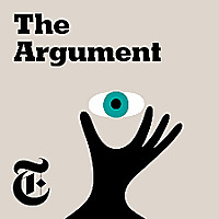
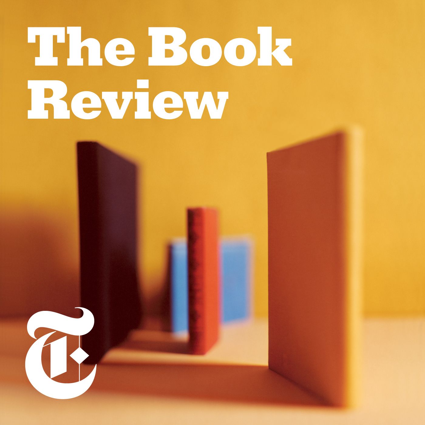
For example, The New York Times incorporates its iconic logo into its podcasts—including The Daily, Sway, The Argument, The Book Review, Modern Love, and Still Processing, to name a couple. Each podcast has its unique identity, but they’re all tied together by the NYT logo.


C. Podcast Imagery and Graphics.
Podcast imagery is basically the graphics and images you use in your content. It’s whatever goes on social media, on your website, or in any other medium/platform.
Podcast imagery is key to your podcast brand, similar to the podcast cover art designs and podcast logo designs. When poorly done, it sticks out like a sore thumb—and when well-thought-out, it can spice up your lead generation efforts.
Here are some best practices for superb and impactful podcast imagery:
- High-quality images and vectors are non-negotiable in podcast imagery. And watch out for copyright laws.
- Should capture and portray the podcast brand’s look and feel across the board, including the business podcast’s fonts, color schemes, and personality.
- Consider hiring a podcast visual design service with a track record of creating stunning and on-brand podcast imagery for a professional touch.
Finally, Make Your Podcast Brand Consistent!

As mentioned earlier, an effective podcast brand evokes emotions, builds relationships with the audience, and has some ‘real estate’ in their memories. Making your podcast brandable using some of the tips discussed in this lesson is one thing. But being consistent is what cements your identity and sets you apart in an increasingly attractive B2B podcasting industry.
Your podcast brand should be reflected in everything from your podcast cover art designs, social media platforms, podcast logo designs, podcast imagery, and even your podcast website. Everything your listeners see, read, or hear should be consistently on-brand.
Consider creating a unique brand style template to guide your podcast branding efforts. This can include your cover art, fonts, logo, color scheme, and preferred editing style for your podcast imagery.
Remember, stay true to your brand. Allow your branded podcast personality to shine through!
Stay tuned for the last Lesson on Module 2, where we’ll highlight a proven system to help you get potential customers to guest on your podcast.
Don’t know where to begin? Well, we advise you to start by understanding the common podcasting myths and pitfalls to ensure you don’t fall into the traps that lead to so many unsuccessful podcasts.
We talk more about this in the next post of our “Podcasting Mastered” series.